This article is part of my series of projects around Machine Learning. Click here to see the list of projects of this series.
This project is the third assignment of CS-7641 Machine Learning at the Georgia Institute of Technology. The assignment is to study two clustering algorithms on the datasets used in the previous assignments. Then apply four dimensionality reduction algorithms and report any obsverations. Then study the performance of the clustering algorithms on the data after dimensionality reduction. Finaly, run the neural network classifier of the first assignment to the data after dimensionality reduction and study its performance.
Methodology
Tools
Everything was done in Python using Visual Studio Code and the Jupyter extension. The libraries I used are Pandas for data mining, SciKitLearn for machine learning, Keras for the autoencoder, MCA, Numpy and MatPlotLib.
Algorithms
In the first part, I will apply two clustering algorithms : Kmeans and Expectation Maximization (EM) to two datasets and report my observations.
Then, on each dataset, I will apply four dimensionality reduction algorithms : Principal Component Analysis (PCA), Independent Component Analysis (ICA), Random Projections (RP) and an Autoencoder (AE), and report my observations.
I will then apply the clustering algorithms after the dimensionality reduction.
Finally, on one of the datasets, I will train the neural network from assignment 1 on the projected data and with the clustering information.
Metrics
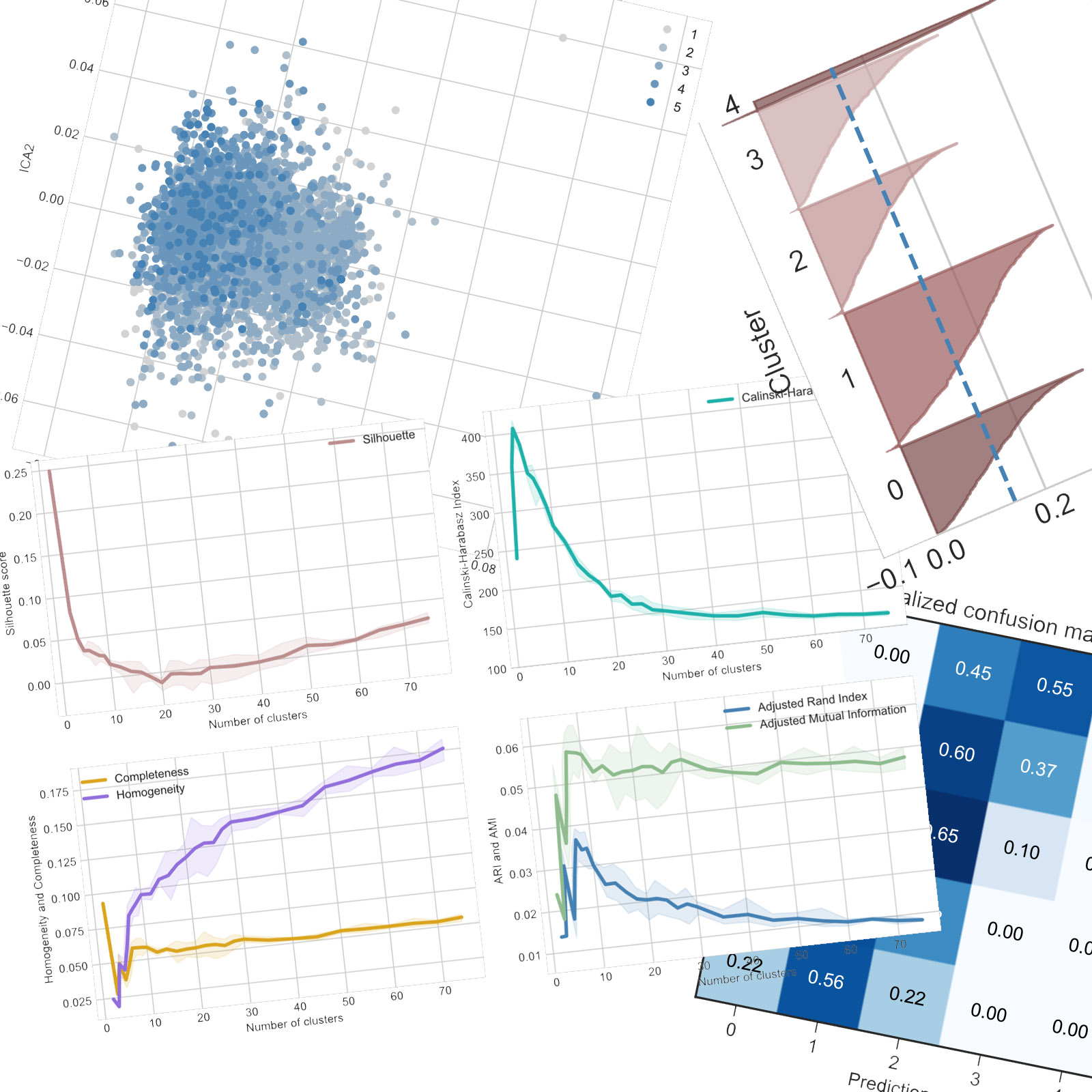
For the study of clustering algorithms, there exists many different metrics. I chose six metrics that I think can give us insight on the performance of the algorithms on the datasets.
First, I use the Silhouette score (Sil) and Calinsky-Harabasz Index (CalHar). Both scores indicate how dense and well separated the clusters but CalHar is unbounded and can give different results.
Then, as we have knowledge of the labels associated with each sample, we can computer additional scores to assess if the clusters correspond to what we could have expected.
The completeness (Com) indicates if samples with the same labels are clustered together, while homogeneity (Hom) looks at the clusters and assesses if they contain only samples with the same labels. It makes sense that, in general, as we increase the number of clusters, completeness decreases and homogeneity increases. This is, as always, a matter of compromises. However, a sharp bend can indicate a better value of the number of clusters.
Adjusted Rand Index (ARI) assesses the similarity of a cluster to a particular class regardless of permutation while Adjusted Mutual Information (AMI) assesses the agreement of the two assignments. Both are adjusted against chance, which is allthe-more important when working with unbalanced datasets.
All tests are run five times to account for variations due to the random starting state and the randomness of the processes of the algorithms. Then the plots feature the average result as the solid line and the min-max envelope in a lighter color.
Datasets
As I used the same datasets as in the first assignment, I will describe them briefly.
All continuous attributes are scaled to be centered and normalized so that when measuring distances, no dimensions dominates all others, which would break the algorithms and lead to poor performance.
Wine Quality
The first dataset is Wine Quality. It is made available by Paulo Cortez from the University of Minho in Portugal on the UCI Machine Learning Repository. This dataset is used in the paper P. Cortez, A. Cerdeira, F. Almeida, T. Matos and J. Reis - Modeling wine preferences by data mining from physicochemical properties. In Decision Support Systems, Elsevier, 47(4):547-553, 2009. While the dataset contains data for red and white wines, I restricted my analysis to the white wines because the target classes are less unbalanced.
It contains 4898 wines with 11 physiochemical proprieties as continuous attributes and a sensory quality score between 1 and 5 which serves as the label.
Wine Review
The second dataset is also about wine, but Wine Reviews scraped from WineEnthusiast in June 2017 by zackthoutt and available on Kaggle. It consists of over 280k wines with their review by the website.
After preprocessing, each sample is defined by 2 continuous attributes, 3 categorical attributes and a label between 1 and 5 again. The categorical attributes are one-hot encoded into over 600 binary dimensions.
For practical reasons, I only use 10k samples out of this dataset for the tests as the computation become too long after that and there are a lot of tests to run.
Clustering
First, let’s compare the performances and behaviors of the two clustering algorithms on each dataset. The study is carried out on a range of numbers of clusters between 2 and 75.
K-means – Wine Quality


The different scores give different optimal number of clusters (k) and this will be observed in pretty much all tests. Using the Elbow method, the Silhouette score gives a k of around 20 while the CalHar score decreases sharply from only 2 clusters. Both ARI and AMI also indicate that only 2 clusters correspond best with the ground truth. The completeness score drops sharply which also indicates that the algorithms tends to break similar samples into different clusters. Thus, the performances are rather poor.
K-means – Wine Review


On the second dataset, the results are more interesting. While the Silhouette score doesn’t feature a sharp bend and keeps decreasing, the CarHar index indicates an optimal number of clusters around 40. This however isn’t corroborated when taking into account the labels of each sample : ARI and AMI both point to around 8-10 clusters and the homogeneity also points to the same result with an elbow around 10 clusters. The completeness decreases more slowly than for the first dataset, indicating that the algorithm tends to do a better (or at least slightly less bad) job of keeping similar samples together.
Expectation Maximization – Wine Quality


Using expectation maximization, the results are somewhat different than with K-means. While silhouette still indicates around 20 clusters, it does it more clearly. The CalHar index is slightly different with a maximum for 5 clusters but a score over four times smaller than for the previous algorithm, which shows that the algorithm performed worse. ARI and AMI also point to a similar number of clusters but they, along with completeness and homogeneity, are slightly worse than for K-means. Thus, EM had more difficulties clustering this dataset than K-means, which is unexpected considering the similarities between the two algorithms.


K-means
Expecation Maximization
Looking at the silhouette profiles for 20 samples for both algorithms, we can see that K-means tends to create clusters of about the same size while the clusters of ExpMax are more unbalanced in size.
Expectation Maximization – Wine Review


Again, the optimal values of k are different but it doesn’t really matter as the scores are so much worse than for K-means : silhouette is well in the negative, which could indicate that the clusters are thin and oddly shaped in a way that most samples are closer to other clusters than their own, CalHar is about 100 times worse and ARI, AMI, completeness and homogeneity are 10 times worse.
However, the expectation maximization of SciKitLearn uses gaussian probability distributions which works for continuous attributes, but less so for binary values of one-hot encoded categorical attributes. This might explain the poor performance of the algorithm on the second dataset. We can envision a clustering algorithm similar to expectation maximization but working with different probability distributions for categorical values.


K-means
Expecation Maximization
Looking at the silhouette profiles for 10 samples for both algorithms, there is little difference. Actually, some clusters seems to have the same profile, and could be very similar : clusters 4 to 8 from K-means and 0 to 4 from ExpMax look similar, however that could just be a coincidence. If this observation is correct, then the difference in performance should manifest in the boundary samples.
General observations
From those tests, Expectation Maximization seems to perform worse than K-Means. However, both algorithms produce clusters that poorly represent how similar we might instinctively group the wines, represented by the scores with knowledge of the labels.
An interesting observation is that K-means produces much more reliable results, as in the scores of all metrics are more consistent from one run to another with a different random state, while Expectation Maximization produces more uncertain results.
Dimensionality Reduction
Principal Component Analysis – Wine Quality


The explained variance ratio drops rather quickly which indicates that the first few principal components to a good job of explaining most of the variance among the samples.

Plotting the cloud of samples along axis PCA1 and PCA2 with their labels, we can observe that all the samples are still clumped together but there is still a higher concentration of better ranked wines on one side.
This visualization gives us an idea of the distribution of samples with the original attributes. We can’t expect the clustering algorithm to perform very well when separating the samples is very difficult. Wines rated 1 to 3 are thus very similar in this dataset, but wines rated 4 and 5 should be clustered better.
As we want to reduce the number of dimensions, I will only keep the PCA dimensions explaining more of the variance than the variance explained by an axis if the samples were distributed uniformly (the explained variance would then be $$1/n_{clusters}$$). In this case, we keep the first 4 components with a total explained variance ratio of 64%.
Principal Component Analysis – Wine Review


The explained variance ratio plot shows that all but a one or two of the PCA axes are useless and explain nothing. This makes sense as out of the around 700 attributes, all but two are binary dimensions corresponding to the on-hot encoded categorical attributes of the original dataset.

On this dataset as well, most samples are very similar and hard to differentiate. However, we can see a gradient of the labels along both PCA1 and PCA2 axes. We can expect the clustering algorithms to work rather well on those PCA axes.
However, again, PCA is made to work with continuous attributes, and this dataset is mostly categorical attributes. For this kind values, we can use MCA, similar to PCA but for one-hot encoded attributes.
Running MCA on the dataset excluding the two continuous attributes :

This time, the explained variance ratio decreases more slowly as more of the components are useful.
To combine the results from the two algorithms, I decided to keep 3 components from the PCA and 20 components from the MCA.
Independant Component Analysis – Wine Quality

The cloud plot of the two main ICA components and from the PCA look very similar with a small gradient of labels that can result in acceptable clustering performance.
The rather poor ICA decomposition can be visualized by calculating the Kurtosis of the original dataset and the ICA components. On average, the kurtosis after ICA is only about 1% higher, statistically meaningless and practically useless.
Thinking about what the dataset represents, we could imagine the hidden independent variables could be the varieties of fruit for instance, affecting the amount of sugar and the degree of alcohol, however their relevance to the clustering performance and the similarity between wines is apparently mediocre.
For the next part of this assignment, I need to reduce the number of dimensions. There exist formulas and theories to try to explain how many ICA components should be kept, however I decided to keep the same number of dimensions as PCA, 4 in this case. That way we can compare the performances for the same compression ratio.
Independant Component Analysis – Wine Review

On this dataset, ICA seems to perform very poorly. Again, this can be explained by the nature of the attributes being categorical. ICA doesn’t seem adapted for categorical values at all.
Here, the kurtosis is actually 64% smaller after ICA than for the original dataset, which shows again that this algorithms, with this implementation, isn’t made to work with categorical data.
Again, for the next part I will keep the same number of ICA components as for PCA/MCA for this dataset.
Random Projection – Wine Quality


Assessing the quality of random projections is difficult and not very relevant in itself. However, this is a good way to visualize the shape of the cloud of samples in the dataset. Again, we can observe one blob of samples but on some of the random projections, like on the bottom right one with the two axes, a slight gradient of labels. This confirms the observations from PCA and ICA that clustering won’t perform great on this dataset.
To know the minimum number of random projections we would need to keep a good explanation of the dataset, we can use the Johnson-Lindenstrauss lower bound. However, as the datasets I use have relatively few samples, this formula gives us a ridiculously high number of projections, in the thousands. There exist other paper and theories trying to estimate how many projections to keep, however, I decided to again keep as many random projections as PCA axes to compare the performance at equal compression ratio.
Random Projection – Wine Review


On this dataset, the results vary a lot. This indicates that the cloud of samples is less clumped than the other dataset.
However, this could just be due to the categorical attributes once again.
This can be very interesting for clustering as we can observe a significant gradient on some of the axes.
Autoencoder – Wine Quality
For the fourth dimension reduction algorithm, I decided to use an autoencoder (AE). That is an hourglass shaped neural network with the same number of outputs and inputs but with a layer significantly smaller in the middle. The network is trained so that the output is as close to the input as possible, that is so that the network reconstructs the data well. Then we split the network after the small middle layer. The first part is the encoder that we use to reduce the number of dimensions and compress the samples and the other part is the decoder.
I first tried with a shallow autoencoder, with a single hidden layer being the reduction layer and ReLu activation as that was lead to the best performance in the first assignment. As this dataset only has 11 attributes, I figured that would be enough. Plotting the average loss for different number of neurons on the hidden compression layer :

As expected, the loss decreases but remains small for any number of neurons. I interpret this as meaning that a single dimension can explain the samples very well. This is mirrored by the results of the PCA we obtained previously. Indeed, the autoencoder can be expected to actually learn the PCA components.
For the following part, I decided to study the clustering after keeping 2, 4 and 8 dimensions.
Autoencoder – Wine Review
As this dataset is much larger, I first decided to try the same approach with a single hidden layer but with more neurons. I also changed the activation to sigmoid, expecting it to perform better for categorical values.

As we can see, the results are terrible. Regardless of the number of layers, it is not able to reconstruct the samples.
I thus decided to use a deep autoencoder with more hidden layers. However, this took a lot longer to train and the space of possible architectures is very large.
Thus, I chose arbitrarily a network of 450, 150 and 30 neurons from the input to the compressed layer (and then symmetrical for the decoder).

Looking at the loss over the number of epochs, we can see that the network learns rather quickly in the number of iterations, but still results in a high loss.
Again, I will blame the categorical attributes. I expected the sigmoid to solve this problem but it did not. I won’t add a layer to turn the floating-point values into binary values for the categorical attributes as the floating-point values should represent the certainty of the network and that could be useful for the rest of the assignment.
Clustering after reduction
In this parti, I ran the experiment with all possible combinations of reduction algorithm and clustering algorithm. As there are many results, I decided to make general observations and show some cherry-picked results that are the most interesting and different ones.
General observations
Overall, for all dimension reduction algorithms, Expectation Maximization performed significantly worse than K-means, similarly to what we observed in part one.
For K-means on Wine Quality, all dimension reduction algorithms produced better CalHar Index scores and Silhouette scores and for slightly larger optimal number of clusters, but had ARI, AMI, completeness and homogeneity scores about 15 to 25% inferior.
On Wine Review however, K-means gave better results with the Autoencoder, but similar results with Random Projections and significantly worse with PCA/MCA and ICA.
For Expectation Maximization, the dimension reduction usually leads to better Silhouette and CalHar Index scores, but about 10% worse ARI, AMI, completeness and homogeneity scores.
At equal compression ratio, the results obtained are inconclusive regarding a possible consistent and relevant advantage between PCA, ICA and RP.
Overall, the results are rather uninteresting showing limited and inconsistent advantages to use dimensionality reduction on either dataset.
Principal Component Analysis
On the dataset Wine Review using the clustering algorithm K-means :


The combination of PCA and MCA leads to a steeper decrease of the silhouette plot and a smaller optimal number of clusters both using the silhouette or the CalHar index and with little to no loss in performance when taking into account the labels. However, the CalHar Index is much smaller.
PCA and MCA can therefore on this dataset with K-means get similarly well-defined and dense clusters but with a smaller number of them, making each cluster larger.
Independant Component Analysis
On the dataset Wine Quality, for both K-means


And Expectation Maximization


ICA leads to a better silhouette and CalHar score with a small loss of performance when considering the labels. However, on the dataset Wine Review with Expectation Maximization :


The results are terrible for all metrics. Note the use of logarithmic scale to show the disastrous CalHar Index.
Again, one dataset with not well-defined intuitive clusters is too limited to reach a significant conclusion, but this along with the results of the ICA from the previous part reinforces the idea that ICA, at least as it is implemented in SciKitLearns, isn’t suited for categorical values at all.
Shallow Autoencoder
On Wine Quality with Expectation Maximization (though the same observation is also apparent with K-means), for a compression layer of 2 neurons


4 neurons


And 8 neurons


We observe that as the number of neurons, that is the number of dimensions the dataset is reduced to, increases, the silhouette and CalHar scores drop below the scores of the original dataset but the scores taking account of the labels increase and get closer and closer to the scores of the original dataset.
My initial hypothesis was that as the number of dimensions increases, the clusters are necessarily less well separated. However, this doesn’t explain why the unaltered dataset with 11 attributes gives scores equivalent to 4 autoencoder dimensions.
Deep Autoencoder
On Wine Review with the Deep Autoencoder and the K-means clustering algorithm (the legend is incorrect and should display DAE instead of RP)


While the ARI, AMI, completeness and homogeneity scores are almost equal to that of the uncompressed dataset, the CalHar score keeps on increasing, indicating that the optimal number of clusters might be way above 75.
This is just weird behavior that I won't even pretend I can explain.
Critical Analysis
Overall, the results are very inconsistent and underwhelming. Using those datasets and algorithms, there doesn’t seem to be any real advantage to use dimension reduction outside the cherry-picked cases described above, making it hard to analyze and explain.
Neural Network Classifier after reduction
The last part of this assignment will study how the feature transformation of the different dimension reduction algorithms and the clustering information helps the neural network we started in the first assignment.
For this part, I chose the Wine Quality dataset because we saw in the previous parts that the categorical attributes work poorly with the algorithms.
Reference
In the first assignment, I calculated the expected performance of the naïve single-minded classifier that always guesses the class with the biggest probability in the dataset. It is about 44.9% and serves as a reference level for the performance of the other neural network classifiers.
Methodology
I will take the same architecture of the first assignment : three hidden layers of 12 neurons each and ReLu activation.
We measure the performance using cross-validation with 5 folds, the confusion matrices and the balanced accuracy as this dataset is heavily unbalanced.
There are the performances we got with the original neural network


| Test accuracy | Crossval accuracy | Balanced accuracy |
|---|---|---|
| 51.4% | 49.8% | 36.1% |
For the following tests, learning curves and confusion matrices wont be provided as they are very similar to the ones above and carry very little relevant information.
Principal Component Analysis
Testing first with only the PCA components I kept, then by adding the clustering information from each clustering algorithm for the “optimal” k we determined previously.
| Test accuracy | Crossval accuracy | Balanced accuracy | |
|---|---|---|---|
| unaltered | 51.4% | 49.8% | 36.1% |
| 4PCA | 46.5% | 50.2% | 28.9% |
| 4PCA + K-means | 46.9% | 50.1% | 29.6% |
| 4PCA + ExpMax | 47.8% | 49.7% | 28.7% |
| 11PCA | 52.2% | 50.0% | 39.1% |
The feature transformation with dimension reduction leads to worse testing and balanced accuracy but similar cross-validation accuracy. Adding the clustering information doesn’t appear to have a significant advantage either.
The feature transformation with the full 11 components PCA led to similar results to the unaltered data with maybe a slight boost of balanced accuracy.
Independant Component Analysis
| Test accuracy | Crossval accuracy | Balanced accuracy | |
|---|---|---|---|
| unaltered | 51.4% | 49.8% | 36.1% |
| 4ICA | 47.7% | 50.5% | 25.8% |
| 4ICA + K-means | 44.3% | 50.0% | 25.9% |
| 4ICA + ExpMax | 44.3% | 49.1% | 25.9% |
| 11ICA | 47.6% | 50.4% | 28.2% |
Again, the testing and balanced accuracies are worse after feature transformation and the clustering information doesn’t affect the results much. However, the accuracies dropped more than with PCA, indicating that PCA is a less bad feature transformation method than ICA.
Random Projections
| Test accuracy | Crossval accuracy | Balanced accuracy | |
|---|---|---|---|
| unaltered | 51.4% | 49.8% | 36.1% |
| 4RP | 43.9% | 50.4% | 27.8% |
| 4RP + K-means | 41.4% | 49.1% | 23.8% |
| 4RP + ExpMax | 44.5% | 49.0% | 25.7% |
| 11RP | 52.2% | 49.9% | 34.6% |
| 25RP | 52.7% | 50.5% | 36.5% |
| 100RP | 52.2% | 50.9% | 37.7% |
The same observation is made, and the drop in accuracy is even more severe. However, with 11 random projections, the accuracies are almost as good, if not better than with the unaltered data.
Therefore, I then tested with even more random projections, more than the original number of dimensions. Indeed, by using almost 10 times as many random projections as there are dimensions in the original dataset, we can gain almost 1% accuracy across the board. However, this isn’t as surprising, more dimensions mean more input, thus more weights, thus a potentially more powerful neural network. The gain isn’t spectacular anyway but the observation is still interesting.
Autoencoder
| Test accuracy | Crossval accuracy | Balanced accuracy | |
|---|---|---|---|
| unaltered | 51.4% | 49.8% | 36.1% |
| AE2 | 42.2% | 49.8% | 22.5% |
| AE4 | 46.7% | 49.6% | 28.7% |
| AE8 | 51.2% | 50.2% | 33.8% |
| AE4 + Kmeans | 45.7% | 48.8% | 30.3% |
| AE4 + ExpMax | 47.8% | 49.9% | 29.8% |
| AE20 | 50.6% | 49.7% | 34.8% |
Here, for a similar compression ratio to the previous dimension reductions, that is for a reduction to 4 dimensions, the drop in accuracy is still present and very similar to the PCA, reinforcing the idea I emitted previously that the autoencoder learns the PCA components as dimensions.
Moreover, the same reasoning from random projections also applies here and more dimensions (the autoencoder isn’t a compression algorithm anymore in this case) gets us closer to the performance of the unaltered dataset.
Conclusion
Overall, the feature selection algorithms don’t provide any benefits in terms of accuracy over the original data, in the case of this dataset at least.
A more in-depth study with more time and resources could uncover advantages for, for instance, datasets with more samples, problems with too many dimensions to be practical, a larger neural network, etc.
Conclusion
All-in-all, with those datasets, clustering worked rather poorly and didn’t help improve accuracy of the neural network. Even though the feature selection and dimension reduction algorithms showed some promise, it didn’t deliver for either clustering or neural network performance.
However, the results are very inconsistent and thus the conclusions have to be conservative. Further study on different datasets is required to make any observation relevant to judge the advantages of the methods described here.

This article is part of my series of projects around Machine Learning. Click here to see the list of projects of this series.
Go back to the list of projects