The motivation behind this small project came while watching a conference by Jean-Marc Jancovici on energy and climate change. One of his main thesis is that we live in the real physical world which is limited, and if we don't act to limit our consumption now, we will hit those limits and be forced to cut our consumption anyway. If we keep growth as our objective, the physical constraints of our environment (climate, resources) will hit us even sooner.
However, it is precisely our exploitation of resources and constant growth in energy which made possible our high standards of living, from abundant, diverse and cheap food, longer life expectancy, entertainment and travels, technology and progress. Asking the population to give up on half of our modern comfort is asking for social unrest leading to revolution (and in a democracy, no politician would promise degrowth in purchasing power and decrease in quality of life to get elected). Therefore, we have to find a sweet spot of degrowth both acceptable to the population and physically possible to avoid collapse.
To visualize this optimization task, I conceptualized Collapse Curves : assuming we can degrow our consumption at a steady rate (to give us time to adjust and for scientific progress to help us), we can estimate if this is enough to avoid physical collapse (from resource shortages or climate change for instance) while avoiding social collapse (from unrest due to falling quality of life). Thus, we can plot collapse curves with time on the horizontal axis and growth/degrowth on the vertical axis. Social collapse curves will bite us from the bottom (too much degrowth) and physical collapse curves from the top (too much growth).
In order to draw the collapse curves, I modeled certain challenges and constraints in a simple simulation. Of course this is a small project and I don't have the abilities to model the climate to IPCC levels or carry out real-life studies on social tolerance to degrowth. Hence, this model is only meant to introduce the concept and visualize the shapes on the curves working with approximations by orders of magnitudes. Here are the curves obtained through this simulation which I will explain in detail in the rest of the article.

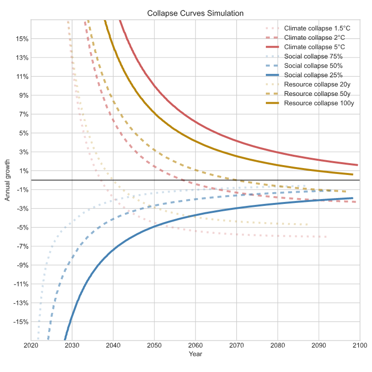
Collapse curves corresponding to climate, resource and social constraints
Simulation structure
The simulation works by steps of one month from 2020 to 2100. Certain parameters are broken down between short term (2020-2030), medium term (2030-2050) and long term (2050-2100).
Growth/degrowth is considered in percentage from an arbitrary unit combining total consumption, GHG emissions and GDP as they have been linearly correlated since we started counting and it is unlikely to change drastically.
A degrowth of 1% per year amounts to a 26% degrowth by 2050 and 55% by 2100. A degrowth of 4% per year amounts to 70% by 2050 and 96% by 2100 ! A scenario considered in the result chapter considers degrowth up to 2050 only.

Demographic growth is considered in order to calculate how much of the consumption each person gets, and thus at constant total consumption, individual consumption must decrease. Using UN estimates, the model considers a growth of 10% over the short term (2020 to 2030 from 7.795Bhab to 8.548Bhab), 15% over the medium term (2030 to 2050 to 9.735Bhab) and 11% over the long term (2050 to 2100 to 10.875Bhab).

Climate collapse curves
The first approximation of this model is to distill the climate change consequences to global warming. Of course our consumption has impacts on biodiversity, extreme weather events, sea level rise and more, but this is a good enough simplification for the purpose of this project. Other critical environmental impacts can be roughly correlated and extrapolated from the climate collapse curves.
Global warming models used by the IPCC are incredibly complex. For obvious reasons I can't match this. However, I can use approximations to model the problem with simple equations and tune the parameters according to the results described in the IPCC reports.
The driving force behind warming considered are GHG (Green House Gases) measured as one value in tonnes of CO2 with equivalent warming effect emitted since pre-industrial times. As of 2020, this amounts to about $$2200 \: GteqCO_2$$ ($$1600 \: GteqCO_2$$ of CO2 alone).

Then, our consumption generates emissions measured in GteqCO2 per year. In 2019 (because 2020 is an anomaly due to the pandemic), we emitted about $$50 \: GteqCO_2$$. Improvements in efficiency which would allow us to consume as much while emitting less GHG is considered in the QOL efficiency factor described later.

Finally, the GHG are given a warming power, meaning given a certain quantity of cumulative emissions of GHG, we expect the average global temperature to rise by a certain amount. The warming power of CO2 equivalent is set to $$1\degree C/2000 \: GteqCO_2$$. Additionally, the warming effect has a certain latency set to $$20 \: years$$ to see $$80 \: \%$$ of the effects.
Collapse from global warming is slow and complex, including rising sea level, reduced food production, lethal outdoor temperature in equatorial regions, mass immigration, extreme weather events, therefore the collapse curves are computed as the crossing of arbitrary temperature increases compared to pre-industrial times (1.5°C, 2°C and 5°C).
Using those parameters, the model indicates that if GHG emissions stagnate (corresponding to between scenarios RCP4.5 and RCP6.0 from the IPCC report), we can expect to reach 1.5°C around 2037 (while the IPCC estimates around 2030), 2°C around 2058 (2050 for the IPCC) and 5°C after 2100 (same for the IPCC). Other reports indicate that low efforts to curb GHG (while keeping a small amount of growth) would lead us to 1.5°C in the early 2030s which corresponds to the model. Estimates by think tanks such as JMJ's The Shift Project show that a 4.5% reduction in emissions per year starting today is required to meet our 1.5°C goal by 2050, which again validates my model. All-in-all, the model can be assumed to be reasonably accurate.
Resource collapse curve
We live on a finite planet whose size and content wont change by much during the century. Therefore, we cannot assume infinite growth, especially in the consumption of resources. This challenge is largely overshadowed by climate change and it is difficult to get a good estimate of its amplitude as the data is constantly refined with great variation.
Helium shortages have started in 2019 and some estimate we will run out in the next few decades. Helium is critical for medical, semiconductor and laboratory purposes. Moreover, the main source of helium is as a byproduct of "natural" gas extraction, which we will have to stop as we curb our GHG emissions.
High quality phosphate ore reserves are set to run out before 2100 which could cause worldwide agricultural yields to drop by 90%. Phosphorus retrieval from sewage is a promising solution but requires large changes in infrastructure.
Certain rare earth elements such as Neodymium, Dysprosium and Lithium are critical for high-tech and renewable energies, and could run out sooner than later. Many such metals are watched carefully. As the name implies, they are scarce in the earth's crust, and while new veins are found regularly, those sources are unpredictable. Moreover, those elements are used in a significantly diffused way, which makes them nigh impossible to recycle.
All-in-all, resource shortages are inevitable as the total supply is limited and recycling cannot be perfectly efficient. Additionally, before the shortages become fatal, the remaining sources are those more and more difficult to access, especially in a context when we try to reduce our infrastructure and energy consumption at the same time. Alternatives are not a valid solution as they are not guaranteed and lead to faster depletion of other resources anyways.
The model used here is simple : we consider a single resource with an initial reserve (of 20,50 and 100 years worth at initial consumption rate) from which we consume a certain amount per year (1 arbitrary unit per year initially) which increases with consumption. Improvement leading to lower depletion such as recycling and alternatives are bundled in the QOL efficiency factor described later.
Social collapse curve
Social collapse is by far the hardest phenomena to estimate as unlike global warming and resource depletion, it depends on each nation's initial standards of living, population growth, tolerance to restrictions and even individual perception of quality of life. Hence, those curves are primarily conceptual.
The first approximation we can take is the Human Development Index, whose three key dimensions are a long and healthy life, access to education and a decent standard of living is purchasing power. We can observe that most nations improve in this metric at a similar rate, though there are still large inequalities between nations. If we consider that degrowth leads to equivalent HDI reduction, then a 50% degrowth from Western nations such as the US and the EU from a HDI of around 0.8 to 0.4 would set us back to the living conditions of post WW2, or about that of India today.

But of course linearity between consumption (aka GDP) and HDI is an unacceptable approximation. The actual relation is more logarithmic with a large variance. Furthermore, looking at the relation in time instead of comparing nations is imperfect as well and doesn't take into account progress in medicine and democracy.

Additionally, what a decent purchasing power is is vague and variable. Hence I decided to use a different model. I consider a linear relation between consumption and a sort of happiness or perceived quality of life, which is what I think matters the most for social unrest. Then, I consider social unrest as the consequence of a reduction of quality of life (QOL) relative to the initial value before degrowth (at 25%, 50% and 75%).
For instance, a 50% reduction of both expenditure and GHG emissions (from $$12tCO_2$$ to $$6tCO_2$$) of the average French citizen could be broken down into : 90% reduction in aviation, 80% reduction in personal car travel, 20% reduction in utilities, 80% reduction in home furniture, 50% reduction in personal devices and internet, 50% reduction in other goods and services, 70% reduction in clothing (purchased, not worn everyday obviously), 90% reduction in meat consumption, 40% reduction in dairy products and eggs, 50% reduction in beverages, 10% reduction in other foodstuffs and finally 10% reduction in public services.
Note that I could not reach a 75% reduction in emissions even by cutting all transport, meat and dairy, and eliminating 90% of all consumption of goods and services, as the part left is mostly energy from housing which has to be reduced by significant nation-wide thermal isolation projects. Moreover, it is unlikely that a reduction of 50% is even possible in emerging and under-developed nations cutting into basic survival needs. Hence, collapse at 50% of pre-degrowth QOL is already generous, let alone 25% (reduction of 75%).
However, as mentioned above, improvements such as thermal isolation are not taken into account. This is modeled by an increase in efficiency described by the amount of quality of life (in arbitrary unit) obtainable for a given consumption (in arbitrary units as well) which is in turn proportional to GHG emissions and resource usage. For instance, a 30% gain in efficiency means cars and planes consuming 30% less fuel per distance, electronic devices and data-centers using 30% less electricity, thermal isolation being 30% more effective, food being produced with 30% less impact (from deforestation which means no organic farming, from transports which means no exotic and out-of-season fruits, and from domesticated animals which means asking them politely to stop burping methane thank you very much), 30% less metal in machines and renewable energy power plants, etc. This efficiency improvement factor is set to correspond to a 30% gain over the short term (by 2030), an additional 10% over the medium term (by 2050) and another 10% over the long term (by 2100) for a combined 57% improvement in efficiency from 2020 to 2100.
Results
Default scenario
Using the default scenario with the parametrization described above, we get the following curves. To read them, consider an annual growth (positive) or degrowth (negative) value on the vertical axis and draw a horizontal line. This line will cross the collapse curves at the date of each event. For instance, With a 2% growth per year, we can expect to deplete our reserves of the resource we had 20 years worth by 2036, reach 2°C of warming by 2038, and deplete the resource we had reserves till 2100 in 2075 instead. Another example, for a degrowth of 2% per year, the quality of life is reduced by 25% (75% of the initial) by 2040, by 50% before 2060, and we still reach 2°C of warming in the 2080s, likely before I die, and at the same time as the quality of life reaches 25% of 2020 (reduction of 75%).
No improvement in efficiency
In the original scenario, I assumed we could improve the efficiency of pretty much everything, quickly and while decreasing GDP and production at the same time. This is of course very optimistic. Here are the results if we remove this assumption ; hence for the same service or good, transportation, food and isolation still consume the same amount of resources and emits the same amount of GHG. As we cal see, as we apply the efficiency on the QOL impact (meaning we measure growth/degrowth as variations in GHG emitted and resources consumed), only the social collapse curves are affected, and of course quality of life is cut faster.

Unsustained degrowth
Sustaining a high degrowth over the entire century is also very generous of an assumption. As I explained earlier, a degrowth of 4% per year amounts to 70% by 2050 and 96% by 2100 ! Meaning in 2100 we would only consume 4% as much as we do today. This is impossible. Let us therefore see what happens if we consider the degrowth set at the horizontal axis to only be sustained up to 2050, then we return to 0% change each year (but the population still increases so consumption is shared between more and more people, still reducing anyone's share). Of course, this only affects the bottom half of the graph, and the climate and resource collapse curves are even worse (collapse comes earlier than if we kept degrowth).

Limited degrowth
However, while infinite growth is physically impossible, so is infinite degrowth. As I explained earlier, I could not find a way to reduce the consumption of the average French by more than 70%. There are irreducible sources of consumption : the world without GHG emissions and only renewable resource is the one we left when entering the industrial era ; we cannot feed a modern metropolis without transportation, refrigeration and intensive agriculture, or even a nation with only the technology and resources we had when 95% of the population were farmers, and even if we could all pick up a hoe again, we would run out of arable land even by deforesting the entire Earth. For the same reason, heating and housing for the still growing population, including the climate refugees, during more extreme weather is not possible, even with biomass and wood while staying sustainable. And of course, any sort of infrastructure making possible the health services is gone.
Therefore, let's see what happens if we limit degrowth to 50%. Don't mind the weird artifacts on certain curves, they are due to border effects. A higher degrowth value on the vertical axis means we reach the 50% total degrowth sooner, then we revert back to 0% change. As we can see, even with a 50% degrowth, we still reach 2°C warming by 2090, and, due to the growing population, there is less and less for everyone, leading to social unrest anyways.

One nation alone
Finally, and perhaps the most revealing simulation, there is one last approximation that cannot be ignored : the world is made of around 200 nations with different populations, recent growth, levels of development and environmental impact ; and there is no central world government able to set a degrowth policy for all nations simultaneously. Degrowth is by very nature painful and undesirable, if a government alone decides to adopt this policy, it will just green itself out of the international economy, and while its population suffers to reduce their impact, the rest of the world's population keeps on getting better. The smaller the nation, the more insignificant its impact can be on curbing global warming or resource depletion. However, the social consequences are felt in full ! When considering degrowth for one nation alone and letting the other keep growing at a reasonable 2% yearly, the social collapse curves of this nation are unchanged compared to previous simulations, but the climate and resource collapse curves are barely changed (except if the nation manages to outgrow the rest tremendously of course).
Here are the corresponding collapse curves for a nation making up 20% of the worlds consumption in 2020 (such as the US or China). While the nation can do great damage by running after high growth, its effect by degrowing is small : switching from no growth to 5% yearly degrowth only pushes back collapse from 5°C warming by about 3 years, and 2°C by barely one year...

And here are same curves for a nation only representing 2% of consumption (such as the UK, France or Germany). Now, even with suicidal levels of degrowth, the effects are within the thickness of the line. And this comes at a tremendous cost to the population of this nation.

Conclusion
Now of course this still is a very approximate simulation. Still, I think this concept of collapse curves has some truth to it and can help explain how significant the challenges we face are.
Go back to the list of projects